Accessibility: HTML Tags
This article has not been updated recently and may contain dated material.
HTML Tips
Screen readers will typically read abbreviations as full words. For example, "LSU ITS Department" might be read as "sue it's department."
This issue can be avoided by:
- Use of periods between letters. (ex. L.S.U.)
- Putting spaces in between the letters of an acronym in an ALT tag.
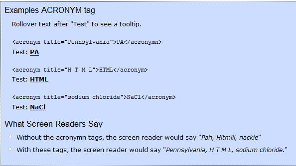
- Including an acronym tag for any abbreviations.
Font
The best fonts to use for accessibility are Verdana, Tahoma, Lucida Grande, Arial, or Georgia, and the font should be no smaller than 9 points. Also, specifying an absolute font size may disable zooming for low vision users and it should be avoided unless absolutely necessary.
Hyperlinks are the only text that should be underlined, and bold should be used instead of italics because the level of difficulty in reading italicized text on a monitor.
Navigation
Page navigation is important for accessibility. Add major headers that screen readers can skip between and include a "Skip to Content" ALT tag. This allows for screen reader users to skip past the repetitive lists of links that they hear every time they refresh and move directly to the content they are looking for.
Using a "Top of page" link will allow for easier control and less scrolling for the motion impaired.
Be sure to include a description of the location of any new pages that your links may lead to. Links that say "Instructions on how to use this product are found here" will be more accessible than "Click here to learn about how to use this product." Also, avoid links that open new windows because this can throw off a screen reader and disables the use of a "back" button.
Referenced from: WebAIM
15287
8/29/2025 8:09:22 AM